Brand OS
The design layer the brains are built on.
Working in AI adoption for long enough teaches you where it actually breaks. It is not capability. AI can produce most of the outputs a company needs. What it gets wrong, over and over, is consistency and brand: the tenth deliverable does not look like the first, the voice drifts, and the color is close but not right. Nobody trusts output like that enough to send it. Brand OS is the brand layer of the Company OS, and it exists to fix exactly that.
Why These Exist
Codify the brand first, then build the brain on top.
A Brand OS is the whole identity written down as a system an AI can actually obey: every color with its measured contrast ratio and the contexts where it is illegal, the type scale, the components documented well enough to rebuild from the words alone, the voice, and the rules framed as things that are never done.
The craft came first: complete brand identities built by hand for a healthcare foundation, for restaurant brands, and for a dental lab group, before it was ever written down as a system an AI could obey.
Every company brain I build starts here, because a rule that exists only in a designer’s head is invisible to a model. Once the brand is a system, the brain’s guardrails can enforce it mechanically: the deploy fails on an off-brand hex the same way it fails on a broken link. That is the difference between AI output that needs a designer to fix it and AI output that ships.
The systems below are complete duplicates of working documents, not portfolio mockups. The teams they belong to use the originals. Two more live as full public websites, linked below.
Browsable in full
GreenRoom · Brand System v1.1
The comedy booking platform. Third complete identity in two days, and the one that stuck. Dark grounds, a spruce green, and every superseded version archived rather than deleted.
Open the brand system → Full systemHomeowner Insights · Brand System v1.0
The Florida reserve-study firm. Tokens with measured contrast, a fourteen-component pattern library, and two published failures written down as laws rather than nudged away.
Open the brand system → Full systemThe Brand OS Master Template
What every system above starts from: the five-part contract a brand system must satisfy before a company brain gets assembled on top of it.
Open the brand system → Full systemSpectrum Killian · Brand OS
The manufacturer identity as a working system: the one that governs the partner microsites and the collateral the brain produces daily.
Open the brand system →Spektra · Brand OS v0.6
A new masterbrand designed end to end and delivered as a fully interactive system: twelve named colors each with a printed reason, the surface law with measured contrast ratios, mark tiers, and motion. It is not linked here, and will not be, until the brand is public. The work is real. The timing is not mine to choose.
The intake form
Roughly sixty questions across eleven sections. A completed form plus a signed-off Brand OS is everything needed to assemble a company brain. Browsable in full.
Read every question →
Live as full sites
FreeBrandTools.com
The whole site and the brand behind it. Twenty-two branded business tools, and the suite ports into every brain pre-seeded with that client’s tokens.
Visit the live site → LiveLegacy Steel Works
Site and brand for a custom welding and fabrication shop. Plain on purpose, fast, and pointed entirely at getting a quote request.
Visit the live site →See the difference
The same request, answered twice.
Pick a task. The left column is a fresh chatbot with no company context, and the right column is the same request routed through the demo Company OS, where every claim has to come from a file.
Recreated outputs from the demo world. Fictional company, fictional products. The generic side is what an ungrounded chatbot produces. The right side is the same request through the demo Company OS.
Generic AI
Subject: Welcome to the family!
Dear Valued Partner,
We are thrilled to welcome you aboard! For decades, our award-winning products have set the standard for industry-leading quality, and we cannot wait to see all the amazing things we will achieve together.
If you have any questions, please do not hesitate to reach out to our team.
Warm regards,
The Team
Through the Company OS
Subject: Welcome to Apex Instruments, Northwind Supply
Hi Elena,
Your partner account went live this morning, and your catalog covers the full Meridian line.
source: partners/northwind-supply/agreement.md
Your account manager is Marcus Reed. He is the one person who answers everything, and his direct line is in your onboarding packet.
source: team/coverage-map.md
Your first order ships under the terms you signed: net 30, no minimums in your first quarter.
source: pricing/partner-terms-approved.md
Glad to be building with you,
Mara Chen
Partner Success, Apex Instruments
source: brand-os/voice.md, approved sign-offs
Dotted underlines mark what the generic model invented. The mono source lines name the file each grounded statement came from.
The Specimen
The system this site runs on, shown as itself.
Everything below is the live file, served from this site at the size it is cleared for. The rest of the site uses one mark on any given page. This page uses all of them, because here the set is the subject.
Colour
Six values, one material, no seventh.
Three carry the identity. Two carry state: Landfall is the colour of things that shipped and Meridian the colour of things in motion, and they now work across the whole site under those roles rather than hiding in status dots. The sixth is the structure the pages are built from. Every ratio below was computed from the two hex values it names, and the failures are written down as laws rather than nudged away.

| Midnight Green --ink · #00272C Ground and ink. There is no second dark. |
White on it 15.8:1 On white 15.8:1 |
| True North --spark · #FF6B1C The needle. The only warm value, and the only one allowed to move. LAW: On white it is never type at any size. It is a fill, a rule, or a shape. |
On Midnight 5.6:1 On white 2.8:1 |
| Paper White --paper · #FFFFFF True white, never off-white. Every line of type on a dark ground. | On Midnight 15.8:1 |
| Landfall --signal · #09E85E Arrival. Live, shipped, passing: the green that means it is running right now. LAW: Never small type on white. Type on a Landfall fill is Midnight. It marks what is genuinely live, never what is merely claimed. |
On Midnight 9.6:1 On white 1.7:1 |
| Meridian --beacon · #279AF1 Motion and information. In progress, in review, and every neutral note that is not a warning. LAW: 3.0:1 on white buys large display and nothing smaller. Small Meridian type lives on dark grounds. |
On Midnight 5.3:1 On white 3.0:1, large only |
| Surface Steel --chrome · #245D63 Structure. Bands, data-strips, the tertiary button, and the link and eyebrow colour on light. LAW: On a dark ground it is a shape, never a label. |
On white 7.4:1 On Midnight 2.1:1 |
Landfall is the pulsing dot on anything running right now: the live work cards, the gate seal’s tick, the current era on the timeline. Meridian rides the Operating Loop’s station dots, the informational notes like this one, and the read-time markers on dark grounds. Surface Steel is the structure: links and eyebrows on light, the steel band, the data-strips, and the tertiary button. True North stays the only accent that sells.

Group A
Five lockups, two grounds each.
The icon sits left or above, never right. The seam rule and the tagline sit under the mark text, never beside it. Clear space is half the icon height on every side, measured from the bezel rather than from the star points. Below 240 px the tagline is dropped rather than shrunk. Below 168 px the wordmark goes and the icon stands alone.
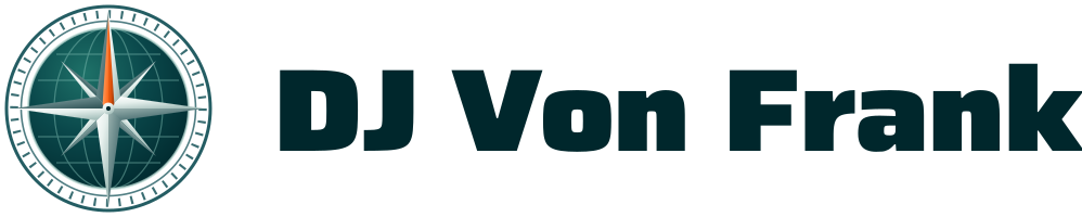
Anywhere with room for the full name. Minimum 168 px.

The same lockup drawn for a dark ground. Type is Paper White.
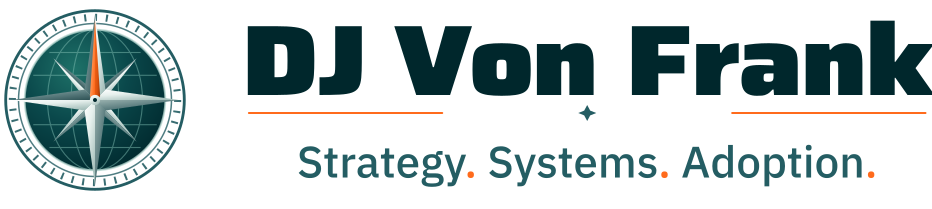
First impression: covers, decks, leave-behinds. Minimum 240 px.
The dark master of the same first impression.
Square or narrow space. Minimum 144 px.

The stacked mark on a dark ground.
Stacked first impression and leave-behind front. Minimum 200 px.
The dark master, drawn to sit on the material.

The working default: site header, email signature, document chrome. Minimum 208 px.

The default lockup on a dark header or dark document chrome.
Group B
Type alone, no icon.
Three marks for the rooms the icon does not fit. The wordmark is artwork rather than live text, which is why every file here ships outlined: a wordmark that depends on a font race is a wordmark that renders wrong on the machine you cannot see.
Type-only full name, with the seam rule and the tagline under it.
The same wordmark reversed.

Avatars, stamps, and anywhere the room is square.

The square-room mark, reversed.
Type-only compact: the letters, the seam, the tagline.
The compact type mark on a dark page corner.
Group C
Four drawings, not four sizes of one.
Each of these is redrawn rather than scaled, and the handoff is a measurement rather than a preference. Below 48 px the full drawing gives up its dashed ring and its graticule, so a different file takes over. Below 24 px the globe and the bezel go entirely and what survives is the rose.

Primary. 48 px and up. Full grid, tick bezel, both stars.

24 to 48 px. The tick bezel goes solid and the grid drops to four lines. Shown here at 44.
Below 24 px, mandatory. The rose alone, north in True North.
One colour, inherits currentColor. Bullets, dividers, list markers, loaders. Shown here in three inherited colours from one file. It is the bullet on this site, and it carries no needle, so inheriting a colour can never recolour one.
Group D
Four tiles, one corner radius.
The radius is always 22 per cent of the tile width, so an app icon and a favicon curve alike. The icon sits at 66 per cent of the tile and is centred optically rather than geometrically, because the north needle is longer than the south point and true centring sits the mark too low.
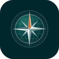
Midnight Green. The default tile.
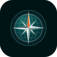
Deep ground, for dark-mode app trays.
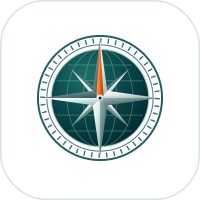
White with a hairline border. Never a bare white tile with no edge.
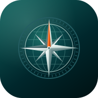
Avatar. Ships square, and platforms crop it round while the bezel survives.
Group E
The reproduction ladder, one rung at a time.
Full colour is the default and everything under it is a fallback with a trigger. If full colour cannot reproduce, the step down is one rung, never two. The black and white masters are the only ones cleared for embroidery, etching, foil and single-ink print, and in one ink the glyph replaces the icon because the globe cannot survive it.
100K only. Embroidery, etching, foil, single-ink print.

Knockout. Foil, etching, embroidery, single-colour merch.
Newsprint and fax. The needle still separates, which is the test this rung passes.
Icon alone, one ink, for small stitch counts and single-needle work.

The same icon reversed on a dark substrate.

The tonal icon, where the grey lockup is too wide for the space.
The sub-24 px rose in one ink. This is the file a pinned tab recolours.

The knockout master of the same drawing, filed for symmetry.
The Point
Design skill is AI skill now.
These pages argue a position: brand systems stopped being a nice-to-have the day AI started producing the volume. A company generating fifty deliverables a month does not have a design problem, it has a consistency problem, and consistency is exactly what a written system plus a mechanical gate can guarantee and a busy human cannot.